Wednesday, October 6, 2010

Boston Bruins

Hey guys, i'm back for another jersey review; this one being the boston bruins


Illustration by Andrew M. Greenstein, The Hockey Uniform Database

 
Since boston has four jersey's in rotation i will be doing seperate reviews. one for the home and road and another for the alt and winter classic

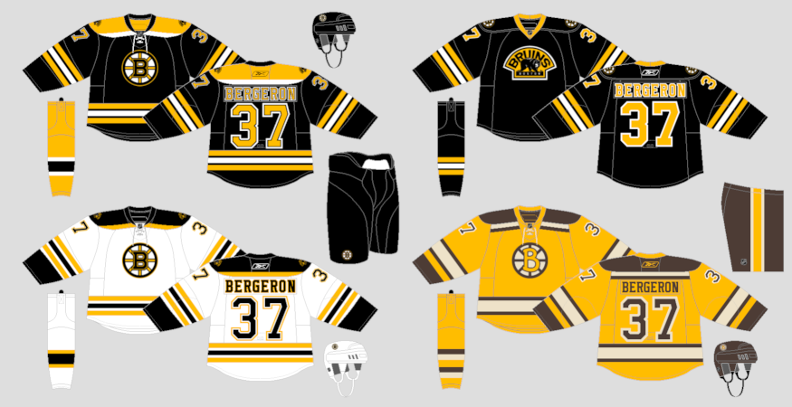
Logo: Perfect update of such an iconic logo. in my honest opinion, the bruins should NEVER change their logo ever again. this one is simply perfect for this team. 5/5

Jersey: the home is just simply perfect as is the logo. However the Away jersey isn't as good as the home, the inconsistent lettering (no white space between the black and gold) is an honerable mention but the thing that i don't like the most is the shoulder yoke. Don't get me wrong i love the yoke it's just the choice of colours that throws it off. 4/5

I would personally do what the Kingston Frontenacs did and switch the black and gold on the yoke, then you've got yourself a good lookin' jersey

Here is what i mean


Final Grade: 9/10
Now on the the alternates.

Logo: The third jersey logo works awesome as a shoulder patch but i don't think it is a strong enough logo to be front and centre on a jersey. The winter classic logo is pretty cool but if it was this then it would be perfect for a full time third jersey, it's just the tacky font that the "b" is in that hurts it. for the pair i give them a 3/5

Jerseys: The third jersey just plain sucks. logo aside, the striping is waaaaay too similar to the home, no hem stripes, that gold collar looks just weird, and the lack of a tie up collar. I do like the introduction of black socks for the first time but other than that; back to the drawing board. The winter classic design is the only good fauxback (modified vintage uniform) that has been introduced since the "EDGE Takeover". the only weak link (other than the logo, but we're talking about the jersey it'self) is the plain gold collar. make it brown and you got a winner. for the pair i give them 3.5/5

Final Grade for the alts: 6.5/10

Tuesday, October 5, 2010

Anaheim Ducks Uniform Review + Welcome to the Blog

Hi to whoever is reading this. Every day or so, i will be reviewing current uniforms for NHL teams. each team will be reviewed at random. When i am eventually done with the NHL i will move onto different leagues (AHL, WHL, OHL, etc) and review them. I will also include C&C for each set and give my opinion on what they should do to improve each one.

my grading system works like this: logos are given a score out of 5 and the jerseys will also be graded out of 5, then i will add up the scores for a final grade out of 10. say for example a team gets  4/5 on their logo and 2.5/5 on their jersey the final grade will be 6.5/10.

Here is the order of teams

ANAHEIM DUCKS
BOSTON BRUINS
CALGARY FLAMES
DALLAS STARS
MINNESOTA WILD
TORONTO MAPLE LEAFS
TAMPA BAY LIGHTNING
MONTREAL CANADIENS
WASHINGTON CAPITALS
COLORADO AVALANCHE
CHICAGO BLACKHAWKS
NEW YORK ISLANDERS
ATLANTA THRASHERS
SAN JOSE SHARKS
COLUMBUS BLUE JACKETS
EDMONTON OILERS
FLORIDA PANTHERS
PHOENIX COYOTES
BUFFALO SABRES
NEW JERSEY DEVILS
DETROIT RED WINGS
NASHVILLE PREDATORS
VANCOUVER CANUCKS
ST. LOUIS BLUES
OTTAWA SENATORS
CAROLINA HURRICANES
NEW YORK RANGERS
PITTSBURGH PENGUINS
LOS ANGELES KINGS
PHILADELPHIA FLYERS

Today i will start with the Anaheim Ducks.


Illustration by Andrew M. Greenstein, The Hockey Uniform Database

Logo: Terrible. It's like Craig Sager's jacket that Shaq ripped during the all star game. It's horrorawful. i give it a 1.5/5
Jersey: The jersey design itself is pretty cool but the things that hurt it are the cut off striping on the hem. If they fixed it so that the striping actually goes all the way around then it would look much better, but the absolute worst thing about it is the colours; they're bland and just plain awful. 2/5
Overall Grade: 3.5/10.