my grading system works like this: logos are given a score out of 5 and the jerseys will also be graded out of 5, then i will add up the scores for a final grade out of 10. say for example a team gets 4/5 on their logo and 2.5/5 on their jersey the final grade will be 6.5/10.
Here is the order of teams
ANAHEIM DUCKS
BOSTON BRUINS
CALGARY FLAMES
DALLAS STARS
MINNESOTA WILD
TORONTO MAPLE LEAFS
TAMPA BAY LIGHTNING
MONTREAL CANADIENS
WASHINGTON CAPITALS
COLORADO AVALANCHE
CHICAGO BLACKHAWKS
NEW YORK ISLANDERS
ATLANTA THRASHERS
SAN JOSE SHARKS
COLUMBUS BLUE JACKETS
EDMONTON OILERS
FLORIDA PANTHERS
PHOENIX COYOTES
BUFFALO SABRES
NEW JERSEY DEVILS
DETROIT RED WINGS
NASHVILLE PREDATORS
VANCOUVER CANUCKS
ST. LOUIS BLUES
OTTAWA SENATORS
CAROLINA HURRICANES
NEW YORK RANGERS
PITTSBURGH PENGUINS
LOS ANGELES KINGS
PHILADELPHIA FLYERS
Today i will start with the Anaheim Ducks.
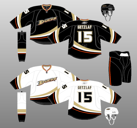
Logo: Terrible. It's like Craig Sager's jacket that Shaq ripped during the all star game. It's horrorawful. i give it a 1.5/5
Jersey: The jersey design itself is pretty cool but the things that hurt it are the cut off striping on the hem. If they fixed it so that the striping actually goes all the way around then it would look much better, but the absolute worst thing about it is the colours; they're bland and just plain awful. 2/5
Overall Grade: 3.5/10.
No comments:
Post a Comment